Cutting-Edge Web Design Aesthetics
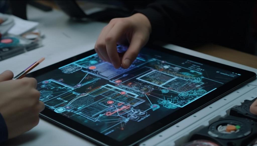
Discover the future of web design through a deep dive into the world of cutting-edge aesthetics. This page explores the trends, philosophies, and technological advancements that shape how digital interfaces captivate audiences. Unlock the secrets behind visually stunning, user-centric, and immersive online experiences by delving into eight pivotal aspects of innovative web design.
Purposeful Negative Space
Negative space, or white space, is no longer just an afterthought—it’s a foundational element that enhances readability and content hierarchy. By consciously leaving areas unfilled, designers provide visual breathing room, guiding user attention and making interfaces more approachable. Purposeful negative space helps convey sophistication, emphasizing key messages while reducing cognitive load and enhancing overall user comfort as they navigate the site.

Refined Typography
Typography in modern web design is about more than choosing a stylish font; it’s about crafting an identity. Refined, legible typefaces set the tone for a site, influencing how users perceive both information and brand character. Attention to font size, line spacing, and letterforms ensures content accessibility and elevates aesthetics, illustrating how considered typography can harmoniously balance form with function in minimalist layouts.

Restrained Color Palettes
Today’s designers are strategically limiting color use to cultivate cleaner, more elegant visuals. Restrained color palettes don’t just support simplicity—they create subtle emotional cues that reinforce a brand’s personality. By limiting themselves to a few harmonious hues, creatives produce web experiences that feel unified and coherent, allowing accent colors to draw attention to calls to action and important content without overwhelming the eye.
Previous
Next
Immersive Interactivity
Microinteractions are the subtle, often delightful user interface moments that provide feedback and enhance usability. From a button that animates upon clicking to visual responses when hovering over elements, these nuanced features inject personality into a site. Although they might seem minor, microinteractions play a vital role in making interfaces feel responsive and alive, enriching the user journey with every small detail.
Advanced Motion Design
Seamless Page Transitions
Gone are the days of abrupt page loads. Seamless transitions—such as fading, sliding, or morphing between states—ensure that navigating a site feels natural and connected. These subtle moments of animation provide context for changes, reduce confusion, and maintain a sense of location within digital environments, all while adding polish and sophistication to the browsing experience.
Animated UI Elements
Animated elements like buttons, menus, and icons do more than attract attention; they signal interactivity and assist users in understanding how to engage with a site. Animation can indicate loading states, transitions, or even prompt actions, all while contributing to a cohesive, dynamic look. Well-crafted animated UI elements elevate usability and reinforce the site’s creative flair.
Custom Illustrations and Artistic Expression
Hand-Drawn Graphics
Hand-drawn graphics imbue websites with warmth and a human touch. Unlike mass-produced visuals, these illustrations convey individuality, inviting users into a world that feels crafted and cared for. Hand-drawn elements work especially well for brands wishing to communicate approachability, creativity, or whimsy, reflecting a commitment to originality and artistic integrity.
Curved elements—whether in banners, cards, or buttons—lend a gentle, welcoming feel to interfaces. Soft edges contrast starkly with the formalism of sharp corners, creating a visual language that feels friendly and dynamic. These forms direct flow, enhance visual hierarchy, and make digital spaces appear less mechanical and more inviting to users from all walks of life.
Bold Color Strategies
Gradients have evolved from subtle background enhancements to full-fledged centerpieces in digital design. Vivid, multi-tone gradients inject depth, energy, and movement into layouts. By blending striking color transitions, designers can create dynamic atmospheres while maintaining harmony with branding, lending each page a unique and futuristic vibe.
Color blocking involves juxtaposing large swathes of solid color to define sections, emphasize hierarchy, and spark visual interest. This approach delivers high-impact contrast, improving scanability and drawing the eye to critical elements. Through thoughtful color combinations, designers maintain balance and vibrancy, guiding users smoothly from one segment of content to the next.
A commitment to inclusivity is evident in the careful selection of accessible color palettes that meet contrast and legibility standards. Cutting-edge aesthetics do not sacrifice usability for style; instead, designers harmonize bold color choices with accessibility principles, ensuring that everyone has a rich and engaging experience regardless of their visual abilities.
Typographic Experimentation
Variable fonts allow dynamic adjustments to weight, width, and other attributes within a single typeface, opening new horizons for responsive and expressive typography. This flexible technology enables seamless transitions between styles depending on context or interaction, enhancing both performance and creative freedom. Variable fonts empower designers to maintain consistency while offering nuanced differentiation across a site.
